
Online home décor blogs and magazines publish dozens, sometimes hundreds, of articles. Tips for furnishing a narrow living room, color ideas for a child’s bedroom, storage solutions for a small bathroom: the volume of content grows, but readers don’t always find it any easier to navigate.
A site map, when designed as an editorial navigation tool rather than just a technical list of URLs, can turn this mass of articles into an easy-to-browse resource. The W3C’s accessibility guidelines also recommend providing multiple ways to access pages (search, site map, breadcrumbs), with clear labels and consistent navigation cues from one page to the next.
Editorial site maps and XML sitemaps: two different tools for navigating home décor content
It’s still common to confuse a site map that visitors can see with an XML sitemap intended for search engines. The first is an HTML page that organizes content for human readers. The second is a technical file that helps Google or Bing discover URLs.
An XML sitemap does not guarantee that a page will be indexed. Google may not download the file, and including a URL in a sitemap guarantees neither that it will be crawled nor that it will be indexed. For a home décor blog, this means that a well-populated technical sitemap is no substitute for a site map designed to help visitors find their way around.
On the Mon Blog Déco site map, articles are grouped into easy-to-understand categories: it’s an editorial starting point, not a raw list of links. This distinction has practical implications: an editorial site map can list the same article under two topics (for example, “living room” and “Scandinavian style”), which an XML sitemap cannot do.

Finding home décor advice without knowing the site’s terminology
A visitor looking to solve a specific problem (“my room is too dark,” “I don’t know what to put above the sofa”) won’t necessarily use the same terms as the site’s categories. If the site map only lists sections such as “lighting” or “wall art,” visitors may miss the content they’re looking for.
Three complementary ways to organize content
A home décor site map is more useful when it offers multiple ways to find the same article:
- By room (living room, kitchen, bedroom, bathroom, entryway, home office): the most intuitive approach, and the one most visitors naturally use when looking for decorating ideas.
- By style or mood (Scandinavian, Japandi, industrial, bohemian, contemporary): useful for readers with a broader project who want a cohesive look throughout their home.
- By problem to solve (not enough light, limited space, tight budget, rental with no renovations): this approach appeals to visitors who aren’t thinking in terms of style yet, but have a specific constraint to work around.
This approach lets an article about mirrors in a narrow entryway appear under “entryway,” “small spaces,” and “wall décor.” Even visitors unfamiliar with terms like “slatted partition” or “panoramic wallpaper” can find relevant advice by browsing for the problem they’re trying to solve.
Labels that describe a situation, not jargon
The W3C recommends that links clearly indicate where they lead and that navigation labels make sense out of context. For a home décor blog, that means choosing “How to furnish a living room under 15 m²” over “Spatial optimization – Living area.” The first speaks to the reader; the second speaks to the writer.
This clarity also benefits people who navigate using a keyboard or assistive technology. Consistent navigation is an accessibility issue, not just a matter of convenience: use the same names, style, and position from one page to the next.
Structuring a home décor site map that stays easy to navigate as content grows
A blog that publishes two articles a week will accumulate more than a hundred pages in a year. Without a flexible structure, the site map becomes an endless list that no one wants to browse.
A common pitfall is organizing content purely by date. Sorting articles by publication date only helps readers who already know when a topic was covered. For everyone else, it’s a wall of links with no signposts.
A useful home décor site map relies on stable categories that can accommodate new content without needing to be restructured. The rooms in a home don’t change from one year to the next. Styles evolve, but slowly. Common problems to solve (storage, lighting, soundproofing) remain the same. These three areas provide a lasting framework.
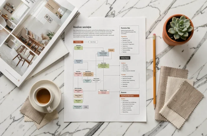
Keep the visible hierarchy to two levels
A site map with three levels of subcategories can discourage visitors from browsing. In most cases, two levels are enough: the main category (Bedroom) and a subcategory (Kids’ bedroom, Primary bedroom, Walk-in closet). Beyond that, readers need an internal search engine, not another layer of links.
Breadcrumbs complement this structure by showing visitors where they are in the hierarchy. Breadcrumbs and a site map reinforce each other: the first shows the path taken, while the second shows all the possible paths.
Accessibility and home décor navigation: what the European regulations change
Since June 28, 2025, the European Accessibility Act has applied to certain consumer-facing online services, including e-commerce, subject to exemptions for some microenterprises. For a site that sells home décor products as well as publishing advice, this makes the quality of its navigation directly relevant to regulatory compliance.
The specific requirements largely overlap with the best practices already described: clear labels, consistent navigation across pages, and clear orientation cues. A well-structured site map helps meet these requirements without a major technical overhaul.
For purely editorial blogs with no sales activity, the directive does not apply directly. Accessibility remains an editorial choice that broadens your readership, particularly for people who navigate by keyboard, use a screen reader, or have a slow connection, where a text-based site map loads faster than a dynamic, multi-level menu.
A home décor site map doesn’t replace the main menu or search bar. It works like a map you unfold when the other tools haven’t been enough. Its value depends entirely on the clarity of its labels and the logic of its organization.
Three ways to browse (room, style, problem), two levels of depth, and labels that describe real-life situations: the framework is simple, and that’s precisely what makes it sustainable as the site grows.